Author: oskrypuch
Subject: Feature Request: better highlight of next waypoint
Posted: 05 Mar 2015 at 5:36pm
I am often left straining to see the precise location of the next waypoint on the screen, especially on approach when the screen starts to become busier. Sure there are datablocks, but I like to be able to visually gauge my position.
Edited by oskrypuch - 19 hours 19 minutes ago at 5:41pm
Subject: Feature Request: better highlight of next waypoint
Posted: 05 Mar 2015 at 5:36pm
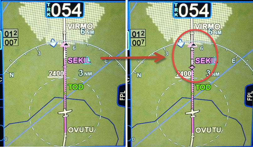
I am often left straining to see the precise location of the next waypoint on the screen, especially on approach when the screen starts to become busier. Sure there are datablocks, but I like to be able to visually gauge my position.
As such, I'd like to request two simple things that would go a long way to this, or if you have any other bright ideas!
1) increase the NEXT waypoint indicator size by say 50%, and give it a slightly stronger border
2) reverse the order of the "barber pole" magenta/white striping, so that the first stripe past the NEXT waypoint is WHITE, instead of MAGENTA, that helps give further contrast.
I have done a little editing in the image below to show what I mean. And although I don't depict it, changing the barber pole to something like 75% white/25% magenta would make it even stronger and less visually confusing.
And for that matter, you might wish to slightly increase the size of the other waypoint marks too.
![]()
* Orest
Edited by oskrypuch - 19 hours 19 minutes ago at 5:41pm